A sampling of work done by Woven Red. Click on a cover to see sample interior pages.
PRICE LIST / TESTIMONIALS / CONTACT
View by project type: Non-fiction / Fiction / Poetry / Covers
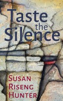
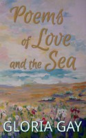
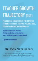
Design Notes: All three books in this 1960s family mystery series were recovered and reformatted at the same time by Woven Red, resulting in a beautiful consistency outside and in. The background sketches on the second and third books started as full-colour photographs. The same bird silhouettes were used on all three covers. I have … Continue reading Kingsville Mysteries Design Notes: The back cover is a portion of the front cover, stretched to fit with transparency applied. Seventeen individual elements comprise the complete cover. Cover and interior design are custom-matched. A separate image highlights each of the eighteen chapters. The lines in the quiz are a table with only the bottom border visible. Note … Continue reading Getting from Hello to Forever Together Design Notes: A dramatis personae (list of characters) can sort out your cast of characters. The design elements on the title page came from the cover artist. The layered chapter titles are managed in Word with two heading styles. Woven Red delivers prompt, efficient service with an eye for both design and detail… and all at … Continue reading Shift Happens Design Notes: The author wanted to use images and fonts to brand her series of six books. After viewing three samples, Suzy chose a combination of sans serif and script fonts to express her feelings about her books. The shoe and heart image were provided by Suzy for her exclusive use at Woven Red. “Recently … Continue reading Catwalk Series Design Notes: There was a lot of information to organize for each whisky on only two facing 5″ x 8″ pages. Borderless tables were used in the Basic Information section and the Whispering section. Another table with only bottom lines provides space for readers to write their own tasting notes; times 60. So that’s 60 … Continue reading Exceptional Experiences of the Whisky Whisperer Design Notes: The title page ornament is reminiscent of a compass rose. A list of works encourages a reader to read more. The table of contents lists only the titles of this collection of tidbits and short stories with chapters. This is how the table of contents for an anthology would be formatted. Design Notes: The author is a fabric artist who wanted a book to sell alongside her art at shows and festivals. The book is sized at 8.5″ square, what some would call a coffee-table book. Inside are photographs of 38 gorgeous artworks with accompanying stories of women through history. My first book was just published … Continue reading Stories, Stitches & Sisters Design Notes: Poetry has greater freedom in interior formatting. Here selected words are highlighted to draw emphasis to the poet’s message. Each poem is centred vertically on the page for visual balance. Covers are free from the dictates of genre, and can be just about any image that pleases the poet. Here is a painting of shoreline … Continue reading Taste the Silence Design Notes: Typically, page numbers are placed in the top margin of all pages, excluding pages that start a chapter. Because this project is mostly chapters of only two pages, very few pages ended up with numbers. So confusing. Moving the page numbers to the bottom margin solved the problem. I have appreciated the professional job … Continue reading Divine Echoes of Eternity Design Notes: It was a delight to use one of Gloria’s own paintings for the cover image. Why cover such a beautiful image with a back cover blurb? Poetry can be tricky to place just right; text boxes can help. I recently had occasion to use Joan’s formatting services, and so came into direct contact with … Continue reading Poems of Love and the Sea Design Notes: The sailing ship motif was used on the title page, chapter start pages, and as a decorative element on the inside margins of the photo gallery. Note the rope font used for the chapter number. The print versions of Game On (hard cover and trade paperback) showcase 34 full-colour images, each framed and captioned. … Continue reading Game On Design Notes: A project with two main sections shown by inserting a divider page and a divider entry in the table of contents. The title page repeats the central isolated figure from the eye-catching cover. “I spent thousands of dollars at an author-services press and wasn’t at all happy with the service or the … Continue reading Emotional Abuse and Emotional Elder Abuse Design Notes: Dr. Sternberg wanted a plain cover for his text book, so a neutral blue with a discreet shadow was used. The introduction is numbered with roman numerals. Each chapter title is repeated in the headers. The forms in the appendices were also provided in an 8.5″ x 11″ pdf for download and use … Continue reading Teacher Growth Trajectory Design Notes: A complex non-fiction project with auto-updated endnotes and a layered index. It’s hard to find someone who knows MS Word as much as Joan does, when it comes to book formatting. I am a freelance writer and project manager, so to speak, for a 2015 indie book, titled Thinking Hands (covering Canadian medical … Continue reading Thinking Hands Design Notes: My first project, my own book, with its new cover! When a chapter has a title, the table of contents can show both the chapter’s number and its title. The cover image a father and daughter playing on the beach comes from altanaka via fotolia.com. Design Notes: Author Susan Riseng Hunter wanted to present her memoir as poetry. She chose a dramatic black and white image which I framed up close and personal, into the heart of the fragile dahlia. The font was also chosen for its fragile nature. Design Notes: Author JoAnn Levy obtained permission from the California State Library to use ‘Indian Woman Panning Out Gold,’ from Hutchings’ Illustrated California Magazine, Vol. III, 1859 on the front cover. The title font is based on the Clarendon font registered by Robert Besley and the Fann Street Foundry in 1845. Inside, rather than using … Continue reading Yosemite Farewell Design Notes: A cheerful presentation of a serious subject, teaching young children, written by a teacher for teachers. Design Notes: When searching for an image to feature on the cover, I didn’t have to look farther than the title. For the non-fiction interior, the page headers in each chapter change to match the chapter heading. As a first time author, I did an extensive internet search for reliable and excellent creative formatting services. … Continue reading Peeling an Artichoke Design Notes: The title and scene break ornament was selected to match the flourish of the W in Wicked on the front cover. The drop cap font is the same as the title page and chapter title. I looked through the PDF [print] file and got all tingly. It’s so pretty! ~ CJ Burright, Author … Continue reading Wonderfully Wicked Design Notes: Author Linda Smolarek had 41 charming illustrations by Maureen Heroux sprinkled throughout her children’s book to highlight the plot. The larger illustrations were sized the full width of the page while the smaller images were nestled into the text. Using a canoe as a whimsical scene break completed this appealing book. Design Notes: Author requirements for a romantic suspense novel included: a red-haired woman, a street in Cusco, and an Inca mask. All the elements came together beautifully. For the interior, small caps distinguish chapter and scene breaks. Thank you, Joan, for your work on my latest romantic suspense novel. The formatting is clean and professional, … Continue reading Let the Stranger In Design Notes: A perfect example of how a single image can make a great cover. Did you know there are fonts for ransom notes? Just a bit unnerving. The cover image is by Kirill Linnik at Dreamstime.com. Joan Frantschuk of Woven Red Author Services took my manuscript and made into a beautifully crafted book that I can proudly … Continue reading You Are Mine Design Notes: The short story is told from the perspective of a wedding dress that ends up in a charity shop window. The image was a lucky find from Csák István at http://www.fotolia.com. This booklet prints landscape on letter-sized paper in such a way that when the pages are stacked and stapled through the middle, a … Continue reading Second Chance Dress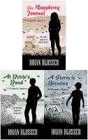
Kingsville Mysteries

Getting from Hello to Forever Together
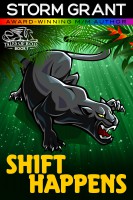
Shift Happens
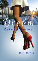
Catwalk Series

Exceptional Experiences of the Whisky Whisperer

Pirateship Down
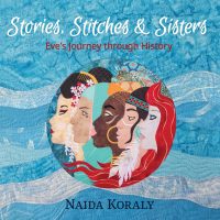
Stories, Stitches & Sisters
Taste the Silence

Divine Echoes of Eternity
Poems of Love and the Sea

Game On

Emotional Abuse and Emotional Elder Abuse
Teacher Growth Trajectory

Thinking Hands

Above Scandal

Fragile

Yosemite Farewell
Teaching in the Spirit

Peeling an Artichoke
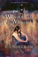
Wonderfully Wicked
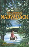
Narvadack
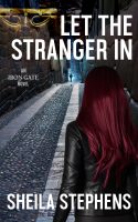
Let the Stranger In

You Are Mine
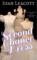
Second Chance Dress


