“I’m a self-publisher. I have a great story with a beautiful cover. The content has been professionally edited and is as close to perfect as it’s going to get. Is there another way to make my print book stand out?”
Yes, absolutely.
From what I’ve observed, big publishers use standard font sets for most of the books they release. If you’re a BIG NAME, you might get an interesting title page or headers.
Self-publishers can call on the expertise of their formatter to dress up a print book with fonts chosen just for you. But, fonts are more than a pretty face.
Fonts Have Purpose
Fonts are created with a specific purpose; sell a product, give you directions, hide the fine print. Figure 1 shows a few more.
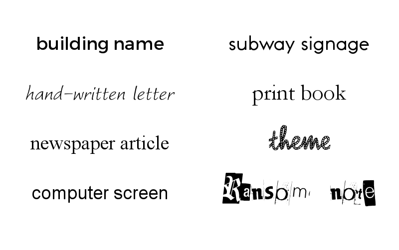
Figure 2 Fonts, down and across: Montserrat, Worstveld Sling Oblique, Times New Roman, Arial, Toronto Subway, Garamond, Rope MF, Black Casper
Fonts Make Promises
A book cover delivers a promise about the content, the font supports that promise. If your font goes against the promise, a browsing shopper is confused. Confused shoppers don’t buy. Figure 2 shows some confused examples. Can you tell which font should go with which genre?
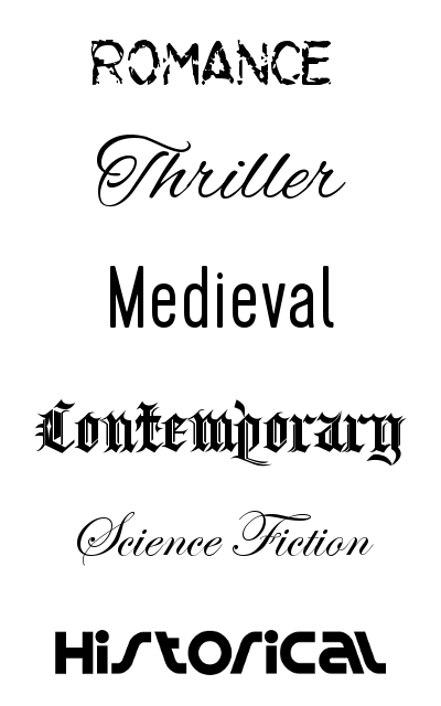
Figure 2 Fonts: Lilac Malaria, Alex Brush, Cervo, Kingthings Spikeless, Edwardian Script, Spin Cycle
When you’re selecting a font, ensure it matches the purpose (self-help, fiction) and the promise (romance, sci-fi, literary) of your book.
Fonts Deliver Content
Most of the samples in the Figure 2 above are for covers, title pages, and chapter headings. The bulk of your book will be in paragraphs.
What difference does paragraph font choice make?
In Figure 3, note the height, width, and line spacing of the various fonts which are all size 11.
A font with wide spacing between the lines will give you a longer book. Handy if you want your novella to appear bigger. A shorter, denser font will help you save paper when printing your epic fantasy.
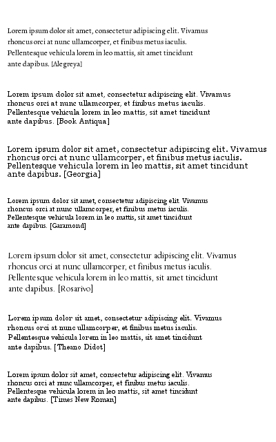
Figure 3: The familiar Times New Roman is at the bottom for comparison.
Fonts Come from Foundries
A company that creates fonts is called a foundry; hearkening back to the days when letters were individual pieces of cast metal. To use the character sets, download and instal them on your computer. Close your app (Word) and and re-open it to see your new font in the list of available fonts.
Fonts are Copyrighted
Make sure your selected font comes with a licence for whatever purpose you have in mind. My favourite site to shop for free and near-free fonts with commercial-use licences is www.fontsquirrel.com There are lots of reputable places where you can buy fonts as well; many have a newsletter with sales notices.
Check the descriptions. One I recently looked at said “a copy of Disney’s ‘Pirates of the Caribbean’ font”. Yipes! Would you like to be sued by Disney over copyright? Not me; I like my money in my bank. That font is not going to make onto my computer.
Private use means exactly that. Write a letter to Grandma, don’t create a cover or decorate a manuscript.
Many licences will have an address for donations where you can show your appreciation for the font artist’s clever design that expresses exactly what you want to say with your words.
Does your cover artist and formatter know where their fonts come from? Ask them!
Links for You
Sampler: An Epic List of Best Fonts for Genre Over 300 fonts show an amazing variety.
Book: Butterick’s Practical Typography Free in-depth knowledge. Loved it!
Article: Safety on the Highways Who knew?
Infographic: Serif vs Sans Serif Fonts Mandatory reading for self-pubbers.

Reblogged this on Gina X. Grant and commented:
A fontish primer.
LikeLike