Small, dropped, raised… add a little something-extra to your print book. Caps, aka capitals or upper case letters, start a sentence. In print books, caps can be added to highlight the first few words of each chapter or scene.
Small Caps
Using all caps is the equivalent of SHOUTING AT YOUR READER. Not a wise thing to do. Instead use classic small caps that blend larger and smaller capitals. Three to five words is standard.

Sometimes, that all-important first sentence is less than five words (like here). You could apply small caps to just that significant sentence.

Drop Caps
The first letter of the first word is made very large and dropped to match the baseline of the second sentence.

Raised Caps
The first letter of the first word is made very large and raised to match the baseline of the first sentence.

Combinations
Small, dropped, and raised caps can be used in combination. If a quotation mark is the first character, it’s included in the small caps feature.

Fancy Caps
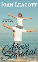
Typically the large leading capital is in the same font as the text. For an extra-special treatment, another font that matches the genre of the book, can be used. This fancy dropped caps font matches the font on my cover, pictured below.

The excerpts are from the first six scenes of my own book, Above Scandal. Here are two versions of the cover with using small caps for my name or not using small caps. Which do you prefer?

© 2016 Joan Leacott

I prefer the small caps. It adds weight and importance to the name, without sacrificing readability.
LikeLiked by 1 person
Hey, Gina! Good point. It’s hard for mixed case to stand out against the flourish of the title.
LikeLiked by 1 person