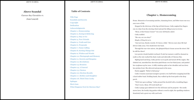
“It looks fabulous!” said a client of the print book I delivered. “It makes me happy just to flip through it!”
“It’s so… um… consistent?” said the same client when reviewing her ebook. “Why don’t the two books look the same?”
True observations and a common question.
As shown in figures A and B, samples of my own book, the differences between the two formats can be remarkable. The ebook is kinda plain. The print book is exciting; look at all those fabulous fonts!
The difference is all about the demands of ereader technology.
A true ebook (mobi or epub, not pdf) has three features that make an exciting layout nearly impossible; it’s clickable, responsive, and flowable.
Clickable
The ebook table of contents is clickable. Click a chapter heading and you jump to that chapter. If you have a descriptive chapter title, it all gets put on a single line, rather than two lines like in the print book. Then the link in the table of contents shows the description.
You can also click onto the author’s website, pop over to the retailer and leave a review, and even buy the next book. Can’t do any of that with a print book!
Responsive
When a person is reading an ebook, on most devices (Kindle, iPad, smart phone, etc.) they can change a number of settings; font face, font size, space between the lines, justification, margins, and orientation.
The ability to change the font face and size is why I only use Times New Roman (TNR) for the ebook text. All devices can change TNR to a font of the reader’s choosing. Unusual fonts, like my favourite Alex Brush, won’t translate and the book becomes unreadable.
I could embed the unusual fonts, but that makes the file a lot bigger. Some retailers don’t take kindly to oversize ebooks, charging extra for buyers to download or not accepting the upload in the first place. And who knows what the ereader will do?
Flowable
The device responds to these settings and reflows the book. As there are dozens of devices each with dozens of settings, there is no way to predict where the text will land. What may be odd one moment might be perfect the next. It all depends on the settings. Try it yourself on any device where you can read a true ebook.
For the same reason, the device assigns page numbers and page headers, not the formatter.
The best content is consistent and predictable (fabulous!), and goes with the flow of the reader’s settings. Sometimes that means an odd placement of text. Sometimes the device will hyphenate in odd ways. That’s how ereaders work. There is no way to control the huge number of variations that happen at a reader’s whim.
Up the Excitement
There is one way to add a drop of excitement. You can add an image of the print book title page to your ebook, see figure C.
As part of the package, I’ll create one for you to match the fonts chosen for your chapter titles.
Or you can have your cover designer create one that matches the cover of your book. Just send it along with your manuscript.
Plain Works
So, even though it’s plain, consistent text means your reader is excited by your story and not frustrated by a technological glitch.
And excited readers are a very good thing.
© 2016 Joan Leacott


Thanks for the clarification. Hope you don’t mind that I re-posted on Facebook.
~g.
LikeLike